


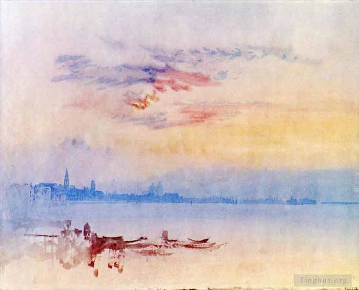
Venice Looking East from the Guidecca Sunrise
Joseph Mallord William Turner
- Price: Price on Request
- Art Type: Various Paintings
- Size:
- English Comments: 0
- International Comments: 0
- Creating Date:
- Introduction and Works of Joseph Mallord William Turner >>

Work Overview
- Venice, Looking East from the Guidecca, Sunrise
J.M.W. Turner
Date: 1819
Style: Romanticism
Genre: cityscape
Media: watercolor, paper
Dimensions: 22 x 28 cm
Location: British Museum, London, UK
The subject of this evocative but at first sight somewhat generic evocation of the distant skyline of Venice has been a cause of speculation as to its topography (and consequently which end of the day might be represented) until its subject and thus its orientation were firmly established relatively recently.1 Finberg annotated his laconic 1909 Inventory title ‘Venice’ with ‘Lagoon’.2 In another copy he noted: ‘Salute in distance’.3 The Turner scholar C.F. Bell annotated another copy: ‘from the Giudecca looking east, sunrise’.4 Bell similarly annotated Finberg’s In Venice with Turner (1930): ‘From the Giudecca, looking East, sunrise? I cannot feel at all sure abt the locality of this subject’.5 Finberg later mused:
I am not quite sure of the subject ... but I think it is a view from the Fusina end of the Giudecca looking towards the basin of St. Mark. It is an evening effect with masses of pale grey clouds rising from the horizon, the loose clouds in the upper part of the sky catching the ruddy glow of the sun which is setting behind us on our right.6
In the most sustained speculative account, Lindsay Stainton called the view ‘puzzling’, declaring that there is ‘no point either within the area of Venice itself (such as the entrance to the Canale della Giudecca) or out on the Lagoon from which such a view can be seen’, suggesting that the spire on the left might be intended to evoke the campanile of San Marco (St Mark’s), with the Riva degli Schiavoni waterfront stretching east towards the Giardini Pubblici, albeit with many elisions or omissions, concluding that the this might be ‘an “ideal” view of the famous waterfront reconstructed from memory’ despite its apparent immediacy.7
Ian Warrell has since convincingly linked the skyline of the left-hand half of the view to a double-page pencil drawing in the smaller contemporary Venice to Ancona sketchbook (Tate D14526–D14527; Turner Bequest CLXXVI 20a–21),8 the first being inscribed with notes of colours and tones including ‘all the steeples blood red’. Warrell has observed ‘how Turner played with the positioning of bell towers and domes to produce a greater sense of recession’, while ‘the presence of rosy clouds perhaps indicates a moment just before sunrise’, which ‘could be a directly observed phenomenon’, albeit bearing in mind the annotations to the pencil sketch.9 He has suggested the ‘real or imagined vantage point’ as the Palazzo (or Ca’) Giustinian, on the north side of the entrance to the Grand Canal,10 apparently the viewpoint for the early morning views originally on adjacent pages of this sketchbook (D15254, D15256; Turner Bequest CLXXXI 4, 6), although the pencil sketch may have been made from a little way out on the waters around the Dogana. It is perhaps significant that there are moored boats and a passing gondola at the equivalent point in the pencil sketch to the slight but assured indications of boats and a landing stage in the foreground here.
Warrell has identified the dome and campanile in the distance towards the centre as those of the Basilica of San Pietro di Castello, on the eastern fringes of Venice, although a campanile to its right in the pencil sketch, probably that of Sant’Isepo (otherwise San Giuseppe), north of the Giardini Pubblici, is missing here, as is, more crucially, the Isola di San Giorgio Maggiore and its church; given the proportions of this composition compared with the pencil sketch and Turner’s tendency to laterally compress panoramic views, it might have been expected in the middle distance towards the right11 (compare its scale in D15254). Perhaps Turner sought to preserve the subtle sense of recession as the blue skyline fades towards the right without framing it with prominent architectural forms on the right too, the sharply defined silhouettes of what appear to be the campanili of Sant’Antonin’ and San Martino toward the left12 being sufficient to assist the repoussoir effect generated by the shifts between the various blues (for further discussion see the technical notes below).
Like the other three watercolours of Venice made on adjacent pages of the Como and Venice sketchbook (D15254, D15256, D15258; Turner Bequest CLXXXI 4, 6, 7), each depicting buildings across water under various seemingly directly observed effects of morning light, this one has attracted much comment in its own right and as part of that brief sequence; for extensive general discussion of the four Venetian watercolours, see the sketchbook’s Introduction.13 Martin Butlin has characterised Turner’s the present work as showing ‘a directness of vision unparalleled before the Impressionists’,14 while Andrew Wilton has called it ‘the most economical and understated of the group, yet it conjures up the breadth and splendour of the scene with unparalleled clarity’.15 Similarly, Lindsay Stainton has remarked that ‘this is the simplest and most understated, yet perhaps the one which most perfectly captures the evanescent beauty of the city seen from a distance’.16
Diane Perkins has noted how ‘primary colours are used in an unusually direct and economical way which nevertheless evokes the detailed skyline’,17 and Timothy Wilcox has addressed this fusion of deceptively simple means and topographical framework, whereby the ‘view, painted directly onto the dampened paper with no underdrawing, anticipates more clearly than any of the others Turner’s later response to the city’, and it ‘may conceivably have been made later, from memory’ since it ‘speaks of an experience crystallizing intellectually as the artist withdraws physically’, with the artist ‘adopting the method of organizing two-dimensional and three-dimensional space that would become a guiding principal after 1830’.18
Michael Bockemühl has compared the underlying structure of this composition with that of one of the elemental landscape ‘colour beginnings’ still remaining in the sketchbook (folio 10 recto; D15261), comprising bands of colour wash without any specific topographical development yet still evoking sky, water and land: ‘Both have a simple structure of broad bands of colour laid horizontally on top of each other. It would be possible to imagine a further application of paint and gentle outlines to the coloured ground’ of D15261. He has observed in the case of the present work ‘just how economical a depiction can be yet still convey the impression of a complete landscape structure. A very few clearly recognizable structural shapes suffice to give the other pointed and block-like brushmarks in the blue centre-silhouette the semblance of distant spires and buildings’, and although the freer brown strokes below evoke boats in the foreground to conventional emphasise a conventional perspectival effect, the compositional structure, delineated only by the sharp edges of colour rather than any pencil outlines and the colours themselves ‘complement each other’ in the creation of pictorial space.19 Thus Turner evoked ‘the world as he saw it through the effect and counter-effect of the various colours’.20
In 2008 the German-based Japanese painter and photographer Hiroyuki Masuyama (born 1968) produced an LED lightbox image based on the present work as one of a series reinterpreting Turner’s landscapes, combining the original composition with digitally layered photographic landscape and architectural elements.21
- Copyright Statement:
All the reproduction of any forms about this work unauthorized by Singing Palette including images, texts and so on will be deemed to be violating the Copyright Laws.
To cite this webpage, please link back here.
- >> English Comments
- >> Chinese Comments
- >> French Comments
- >> German Comments
- >>Report
- Ulysses Deriding Polyphemus Homers Odyssey
- Carisbrook Castle Isle of Wight Turner
- Arundel Castle with Rainbow detail Turner
- Landscape Composition of Tivoli Turner
- The Vale of Ashburnham
- Rome The Colosseum
- Rome The Forum with a Rainbow
- Kirby Londsale Churchyard
- The Parting of Hero and Leander from the Greek of Musaeus
- Brunnen from the Lake of Lucerne
- The Thames near Walton Bridges Turner
- Hafod
- Slavers throwing overboard the death and dying
- Whitby
- What You Will
- The Lake Petworth sunset fighting bucks
- Bridge of Sighs Ducal Pala Turner
- Old London Brige Turner
- Ancient Italy Ovid Banished from Rome
- Folkestone from the Sea
- Heriot s Hospital Edinburgh Turner
- Giudecca la Donna della Salute and San georgio aka The Guidecca
- The Lake Geneva seen from Montreux Turner
- Atelier Turner
- Raby Castle Residence of the Earl of Darlington Turner
- Cathedral Church at Lincoln
- Welsh Bridge at Shrewsbury
- Virginia Water
- Eruption of Vesuvius
- Prudhoe Castle Northumberland
- Santa Sabes and the Brook Kedron
- Dolbadern Castle 1799
- Sunrise Whiting Fishing at Margate
- Rome From Monte Testaccio
- Chichester Canal
- Venice seen from the Giudecca Canal Turner
- Landscape with a River and a Bay in the Background Turner
- Glacier and Source of the Arveron Going Up to the Mer de Glace
- Wilderness A Engedi & Convent of Santa Saba Turner
- Frosty Morning
- Caernarvon Castle
- St Peter s from the south Turner
- View from the Terrace of a Villa at Niton Isle of Wight from sketch
- Fishermen at Sea The Cholmeley Sea Piece
- Dover Castle
- Weymouth Dorsetshire
- Interior of Fountains Abbey Yorkshire
- Mont Blanc from Fort Roch Val dAosta
- Windsor Castle from the Thames
- Regulus Turner
- Stamford Lincolnshire
- The Morning after the Deluge Turner
- Rome St Peters from the Villa Barberini
- The Festival Upon the Opening of the Vintage at Macon
- Salon 2 Turner
- The Blue Rigi Lake of Lucerne Sunrise
- A Ship Aground
- Scarborough Town and Castle Morning Boys Catching Crabs
- Abergavenny Bridge Monmountshire clearing up after a showery day
- Norham Castle Sunrise Turner
- Dido Building Carthage The Rise of the Carthaginian Empire
- The Burning of the Hause of Lords and commons detail1
- The Bright Stone of Honor Ehrenbrietstein and the Tomb of Marceau
- The Lake of Thun Switzerland
- Ehrenbrietstein and Coblenz
- Caligula Palace and Bridge Turner
- Portsmouth
- Calais Pier with French Poissards
- The Bay of Baiae with Apollo and the Sibyl
- The Battle of Trafalgar as Seen from the Mizen Starboard Shrouds of the Victory Turner
- Rainbow A view on the Rhine from Dunkholder Vineyard of Osterspey
- The Chain Pier Brighton
- Alnwick Castle Northumberland Turner
- Woolverhampton Staffordshire
- Approach to Venice 1843
- Keelman Heaving in Coals by Night
- Rain Steam and Speed the Great Western Railway
- The Fifth Plague of Egypt 1800
- Venice The Dogana and San Giorgio Maggiore Turner
- The Passage of the St Gothard 1804
- Rome from Mount Aventine
- Rhodes
- Dort the Dort Packet Boat from Rotterdam Bacalmed
- Venice from the Porch of Madonna della Salute
- Raby Castle the Seat of the Earl of Darlington
- Flint Castle Turner
- The Shipwreck
- Arundel Castle with Rainbow Turner
- Shipwreck Turner
- Dinner in a Great Room with Figures in Costume Turner
- St Erasmus in Bishop Islips Chapel Westminster Abbey
- Yacht Approaching the Coast Turner
- Crossing the Brook
- Dutch Fishing Boats in a Storm Turner
- Fire at Sea Turner
- Mountain Stream Coniston Turner
- Rocky Bay with Figures
- London Turner
- Odysseus Deriding Polyphemus
- Campo Santo Venice
- Rome from the Vatican 1820
- East Cowes Castle the seat of J Nash Esq the Regatta beating to
- Kenilworth Castle
- Norham Castle on the River Tweed
- Lake Lucerne Turner
- Heidelberg
- Passage of Mount Cenis
- Staffa Fingals Cave
- Dutch Boats in a Gale Turner
- Ships Bearing Up for Anchorage aka The Egremont sea Piece
- Stonehenge Turner
- The Bright Stone of Honour Turner
- Bonneville Savoy with Mont Blanc Turner
- Falmouth Harbour Cornwall
- The Fighting Temeraire
- The Chapter House Salisbury Cathedral
- Valley of the Brook Kedron
- Lancaster Sands
- Okehampton
- Mortlake Terrace 1826
- Petworth Park Tillington Church in the Distance
- Peace Burial at Sea
- Wreckers Coast of Northumberland
- The Burning of the Houses of Lords and Commons
- The Brunig Pass from Meringen
- Venedig Turner
- Shipwreck off Hastings Turner
- Melrose Abbey
- Ivy Bridge Devonshire
- Two women and a letter Turner
- Boscastle Cornwall
- Moonlight A Stody at Millbank
- Salon Turner
- The Bass Rock for The Provincial Antiquities of Scotland Turner
- The Devils Bridge St Gothard
- Kilchern Castle with the Cruchan Ben mountains Scotland Noon
- The fightingTemerairetugged to her last Berth to be broken up landscape Turner
- Fall of the Tees Yorkshire
- Mountains Stream Coniston
- The Burning of the Houses of Lords and Commons
- Venice The Dogana and San Giorgio Maggiore blue Turner
- The Dogana San Giorgio Citella From the Steps of the Europa Turner
- South View of Christ Church etc from the Meadows
- Quillebeuf at the Mouth of Seine Turner
- Archway with Trees by the Sea
- The Fighting Temeraire Tugged to her Last Berth to be Broken up Turner
- Shade and Darkness The Evening of The Deluge Turner
- Fort Vimieux
- The Battle of Fort Rock Val dAoste Piedmont
- Keelmen heaving in coals by night
- Undine Giving the Ring to Massaniello Fisherman of Naples Turner
- Louth Lincolnshire
- One bedroom Turner
- Peace
- Conway Castle
- The big connection channel at Southall Mill Turner
- Snow Storm Hannibal and His Army Crossing the Alps
- Music Company Petworth Turner
- Sunrise with a Boat between Headlands Turner
- The exile and the snail
- First Rate taking in stores
- Cowes Isle of Wight Turner
- Norham Castle on the Tweed Turner
- The Fall of an Avalanche in the Grisons
- Tabley the Seat of Sir JF Leicester
- Petworth the Drawing room
- The Pantheon the Morning after the Fire Turner
- Pembroke Caselt South Wales Thunder Storm Approaching
- The Nordgalerie Turner
- The Slave Ship Turner
- Totnes in the River Dart
- Norham Castle Sunrise
- Interior of Salisbury Cathedral
- Sun Rising through Vagour Fishermen Cleaning and Sellilng Fish
- The Battle of Trafalgar Turner
- Snow Storm Steam Boat off a Harbours Mouth
- Popes Villa at Twickenham
- Ariccia Sunset
- Transept of Ewenny Prijory Glamorganshire
- Sunrise with Sea Monsters Turner
- Buttermere Lake A Shower
- Rocky Bay with Figures2
- The Wreck of a Transport Ship
- Ploughing up Turnips near Slough Turner
- Kidwelly Castle
- Goldau
- Scene on the Loire Turner
- Cowes Isle of Wight detail Turner
- Study Of A Castle By A Lake
- Venice Looking East from the Guidecca Sunrise
- Stonehenge detail Turner
- The Burning of the Houses of Parliament Turner
- Carisbrook Castle detail Turner
- View over Town at Suset a Cemetery in the Foreground
- Painter at the easel Turner
- Playing Billiards Petworth Turner
- Genda
- Storm Clouds Sunset Turner
- The High Street Oxford Turner
- Ingleborough From The Terrace Of Hornby Castle
- Two Recumbent Nude Turner
- Venice San Guirgio from the Dogana Sunrise
- Heriot s Hospital detail Turner
- San Giorgio Maggiore in the morning
- A Canal Tunnel Near Leeds
 Partnering Galleries
Global galleries, museums, and art institutions are welcome to join with us, to promote the artworks of your artists represented.
Latest Joiners
Copyrights Reserved © 2008 - .
![]() Singing Palette
Singing Palette